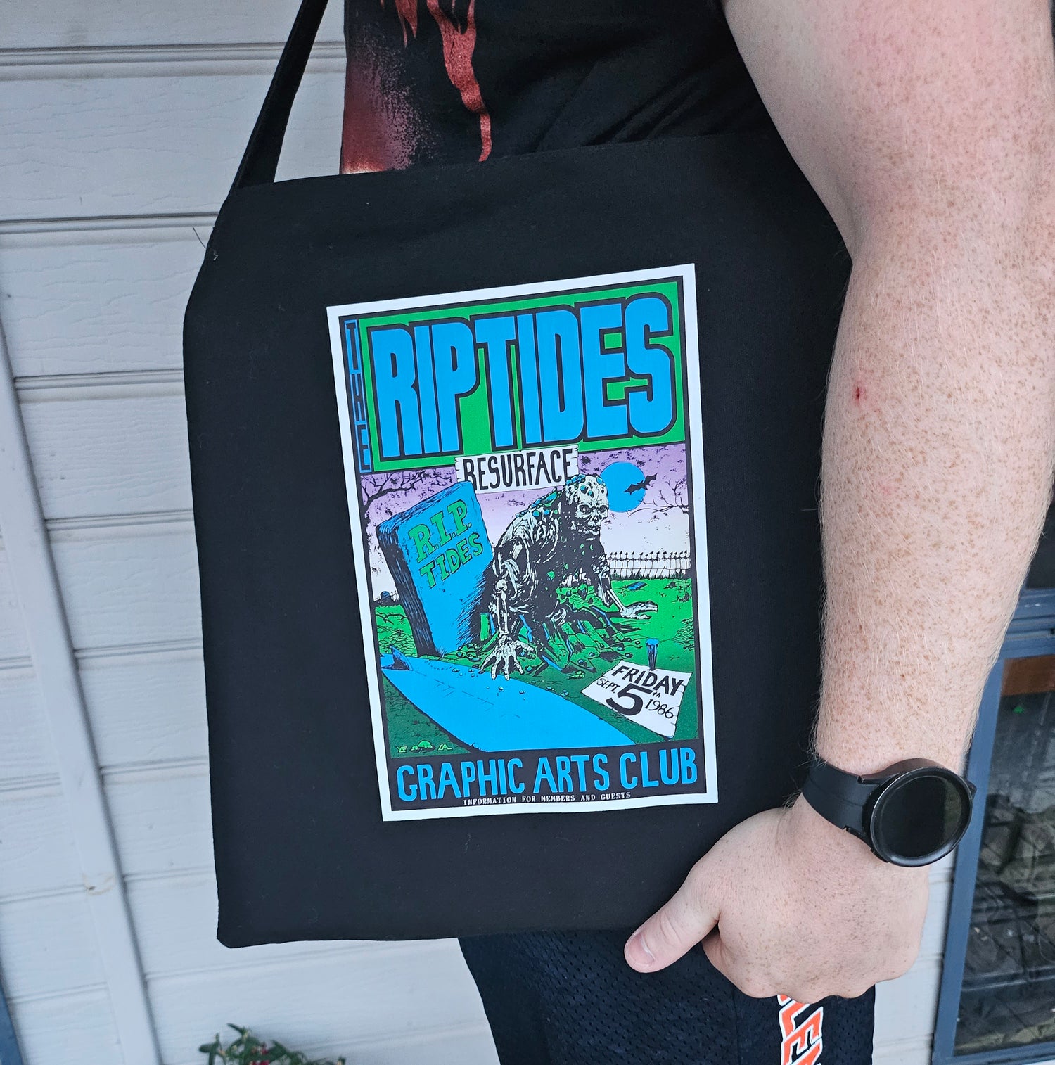
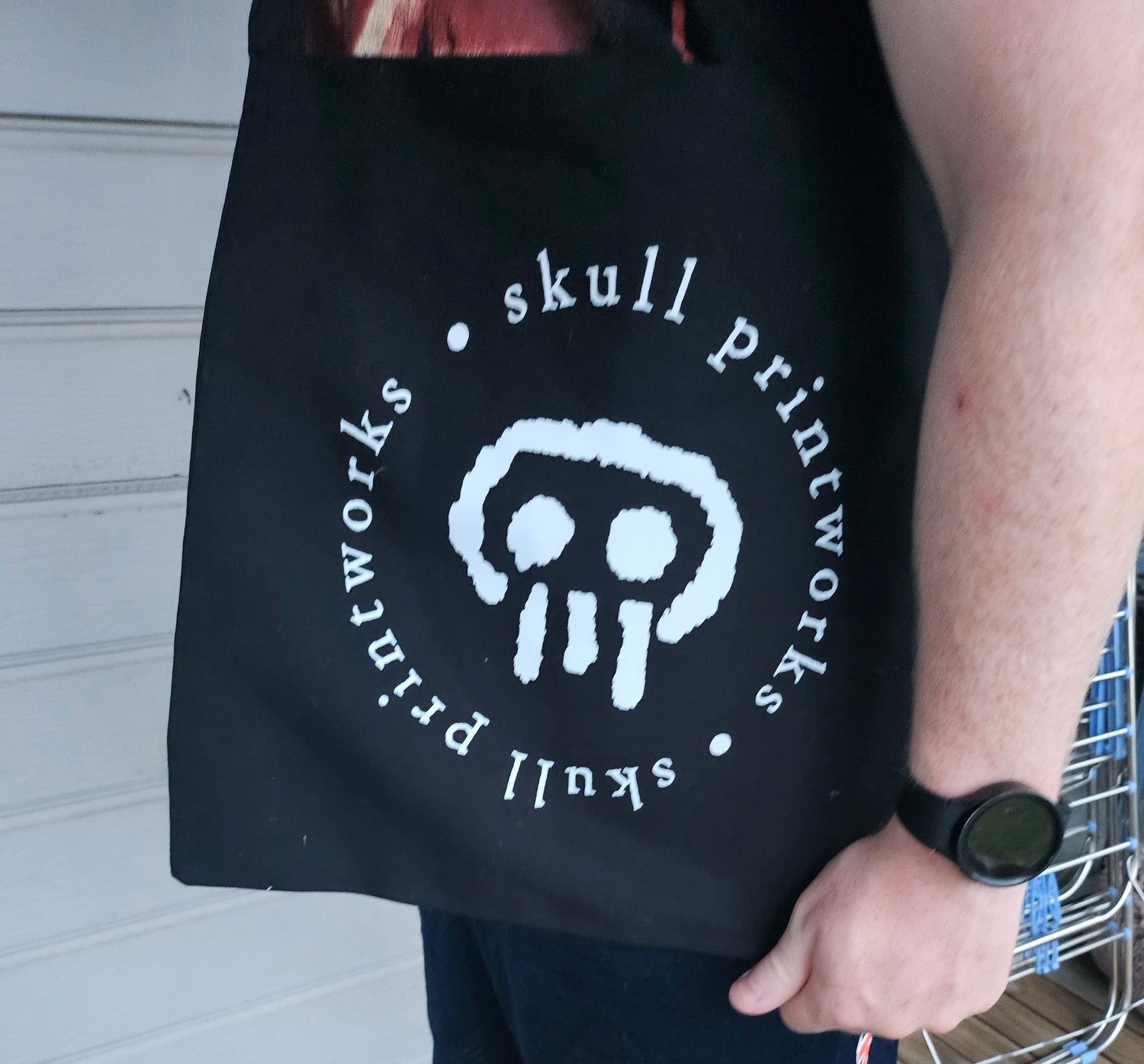
Originally they were in your eye - now they can be in your home! Or on your front!
The original poster designs of John Foy now celebrated in a range of quality limited edition formats…
TOTE BAG - RIPTIDES - BAYVIEW TAVERN GIG POSTER DESIGN
SkullPrintWorks
- Regular price
- $40.00 AUD
- Regular price
-
- Sale price
- $40.00 AUD
- Unit price
- per
Couldn't load pickup availability


So, what's different about the new 'International Edition'?
- the price, instead of $99.00, it's RRP is just $66.00 including GST.
- the exterior dimensions 26 x 29 cms and quality finishes remain the same.
- the page count has been slightly reduced to 232 pages.
- the majority of original content is retained, some simply condensed.
- newly available pictorial images and updated narrative have been added.
- the book is now published by Skull Printworks.
Building the book
Originally simply a monograph, this book evolved into something altogether different.
The project was at one point conceived to be a 3 piece edition contained in one package.
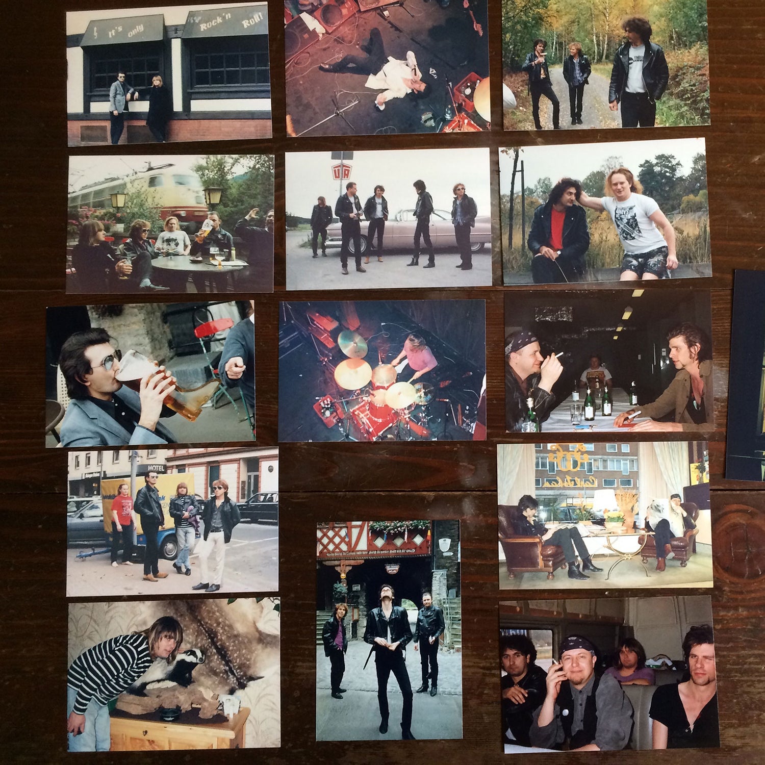
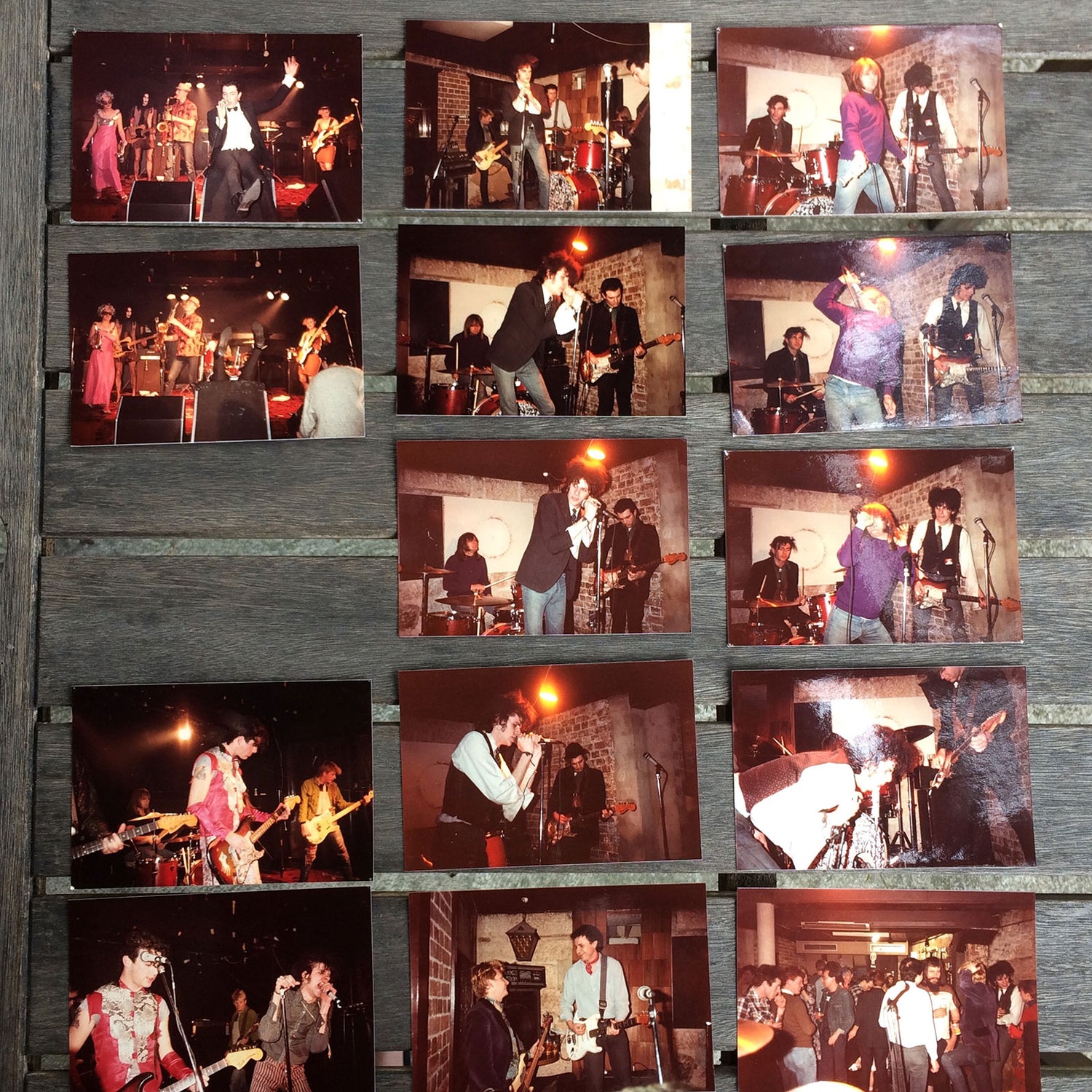
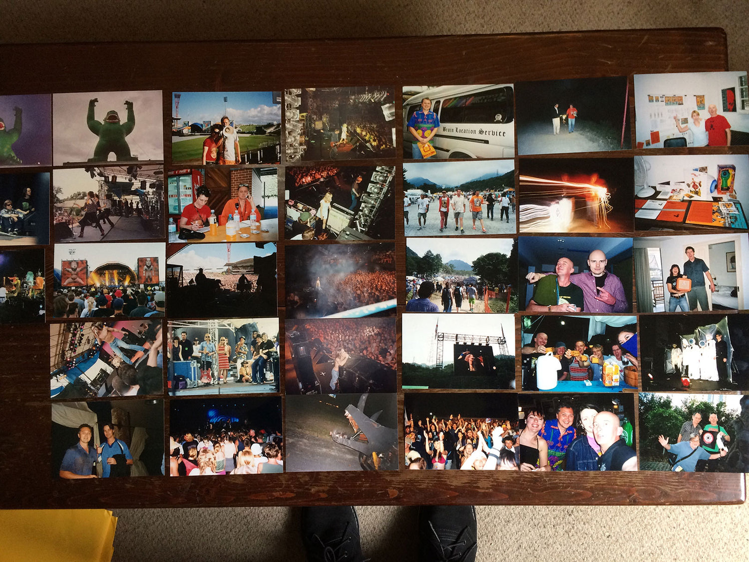
'Snaps' was envisaged to be a magazine format parody of rock periodicals Uncut and Mojo, as a vehicle for the many casual photographs taken during the Red Eye / Black Eye years.
'Crack' had it's origins in the Irish word 'craic' and was to be a unillustrated paperback of anecdotes relating to Skull Printworks, and the Red Eye & Black Eye record labels.
'Pop' was planned as a straight-forward quarto monograph of the posters of 'Skull Printworks', along with a selection of related images and favourite record cover commissions.
Instead, the three were bundled into one, resulting in a broader visual treat, interwoven with spotlights on favourite photographers, and a wider social narrative of the times.
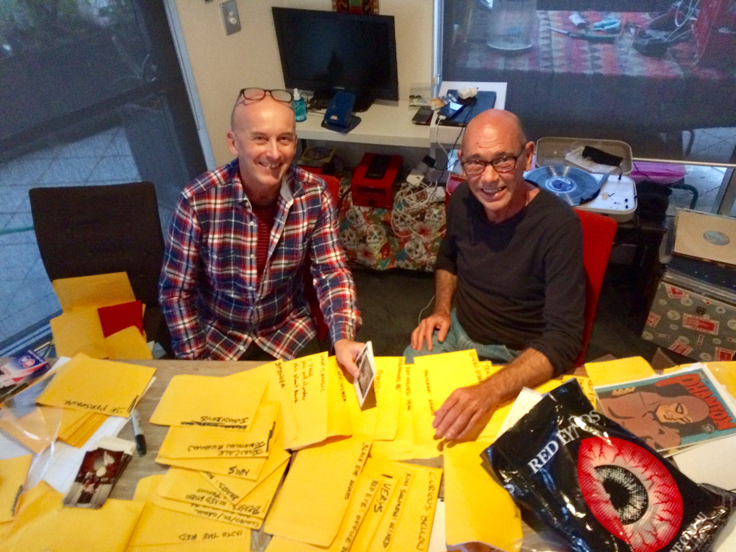
When it came to pulling this book together, it was to Jim Paton that Foy returned - Jim had been present for the majority of the ground to be covered. Although John Foy wrote the narrative and selected the images herein, it's very much Jim Paton's visual realisation. Like a good songwriting team, there's something about the combination.
Image: John Foy and Jim Paton at work on the first edition of SCP! - pic: Ken West.
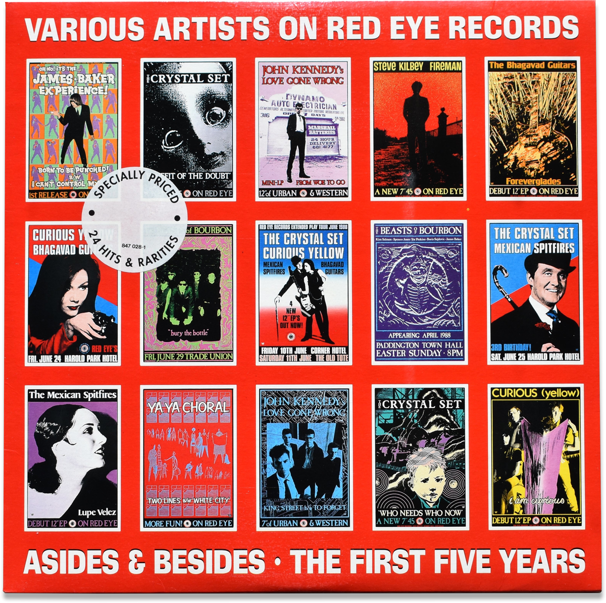
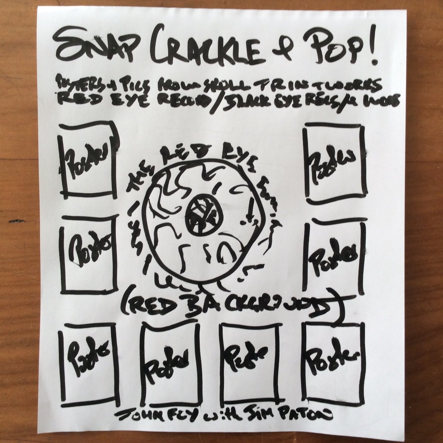
Jim and JF both agreed the book should be a large format, so called ‘coffee table’ size, to do justice to the graphic aspects. JF proposed the cover design of the 2LP Red Eye compilation album ‘Asides & Besides’ as the starting point for the overall exterior appearance, with a large Red Eye Logo added, looming behind multiple posters.
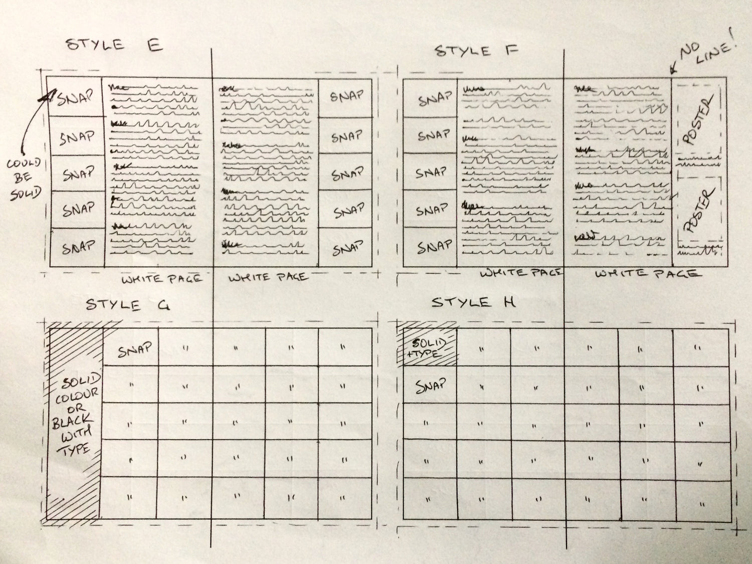
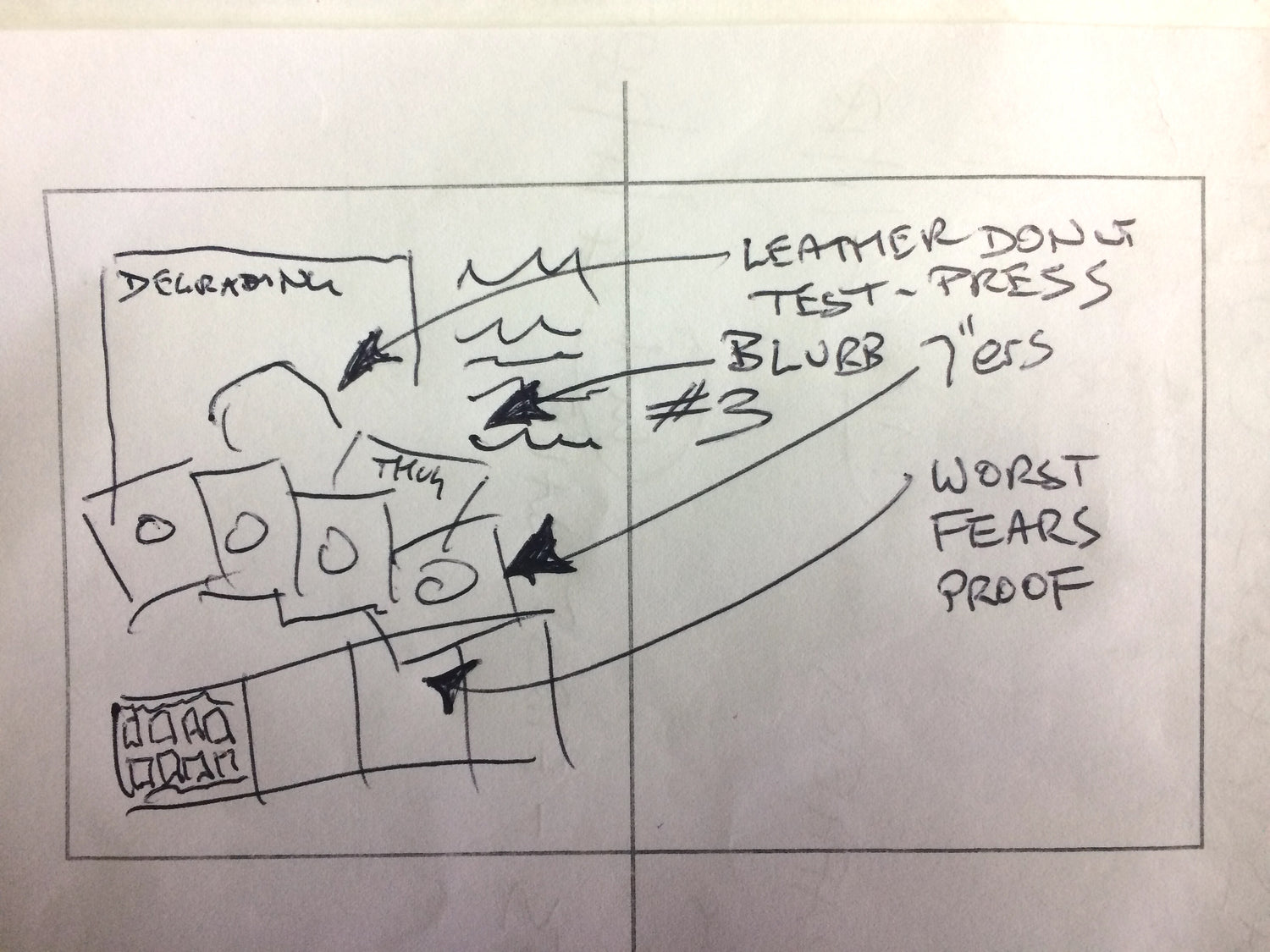
JF drafted various suggested page grids for consideration by Jim, and in a jigsaw approach, they together lay down many of the 100’s of the candid Snaps JF had photographed over many years. JF had a few combinations firmly preconceived, but often deferred to whatever Jim’s fresh eyes found visually most interesting.
This process reflected the overall approach to the book: although the majority of content was very much by and about John Foy, the interpretation and package design of all that was very much the domain of Jim Paton. So Foy set about writing the narrative to glue the the chronology together, while Paton worked his magic with his knowledge of typestyles and graphic balance.
